
Decorating your website with elaborate backgrounds, glossy buttons, and animated cursors might seem appealing. However, this additional embellishment can result in slower load times, ultimately creating a less favorable user experience.
Opting for a simpler approach can be more effective. Minimalist web design, for instance, directs attention to the core purpose. By avoiding unnecessary visual elements, visitors can focus on your product, service, or portfolio.
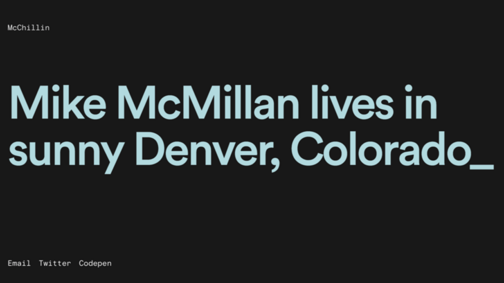
McChill Mike:
McMillan’s portfolio effortlessly navigates with a clean design, animated text, and large, eye-friendly navigation links.
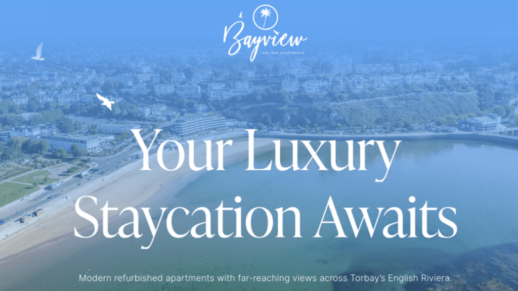
Bayview Holiday Apartments:
Choosing minimalism, this website showcases property photos, offering a glimpse into potential staycation possibilities with island-themed colors.
Zero:
Epitomizing simplicity, Zero features a screen-sized animation introducing services, a mantra, and a record of completed projects.
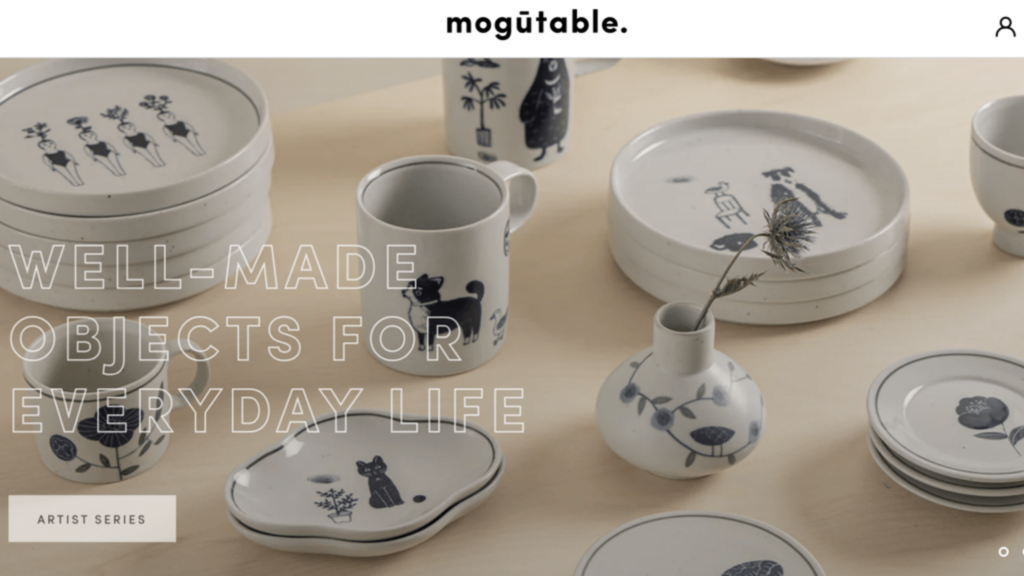
Mogotable:
Presenting products through a photo-centric grid, Mogutable exudes luxury with light colors, ensuring a seamless shopping experience.
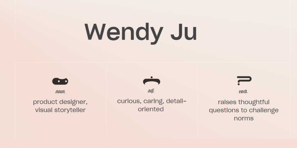
Wendy Ju:
Wendy Ju’s portfolio showcases career highlights in a thoughtful minimal design, emphasizing font choice and color palette.
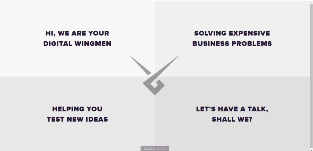
Wingmen:
With a grid layout and a focus on class and professionalism, Wingmen caters to business professionals seeking an appealing design.
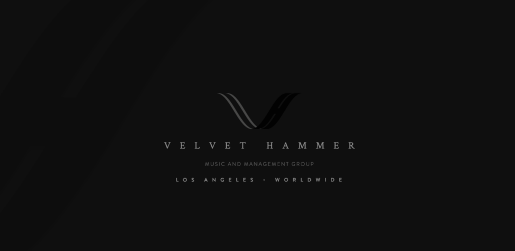
Velvethammer:
Targeting musicians, Velvet Hammer’s solid colors and elegant font convey professionalism, supported by a client list.
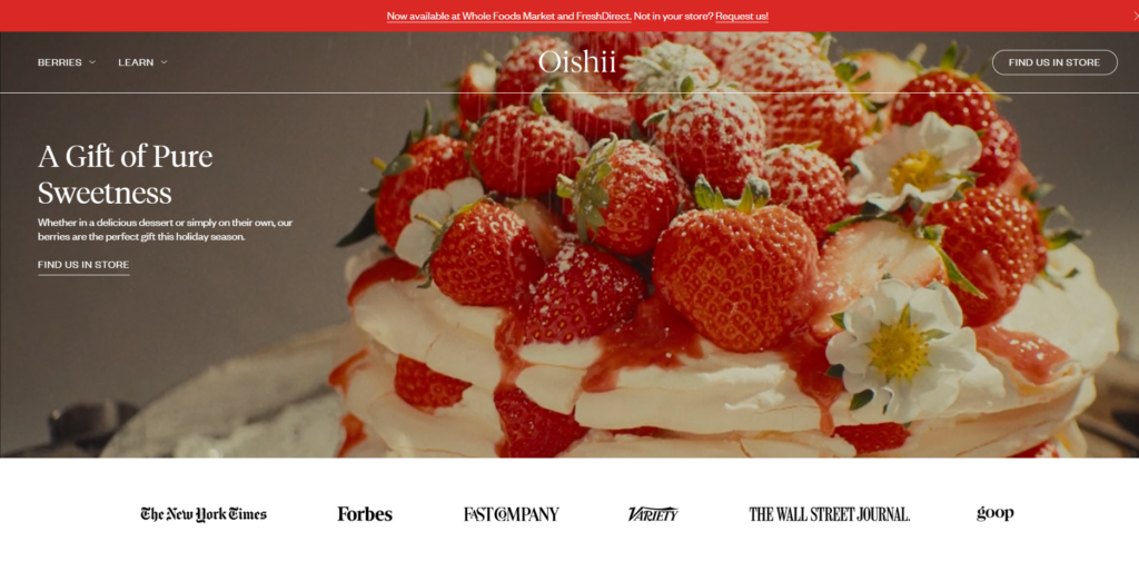
Oishii:
Specializing in berries, Oishii’s website uses pleasant images, providing product information and an easy store locator.
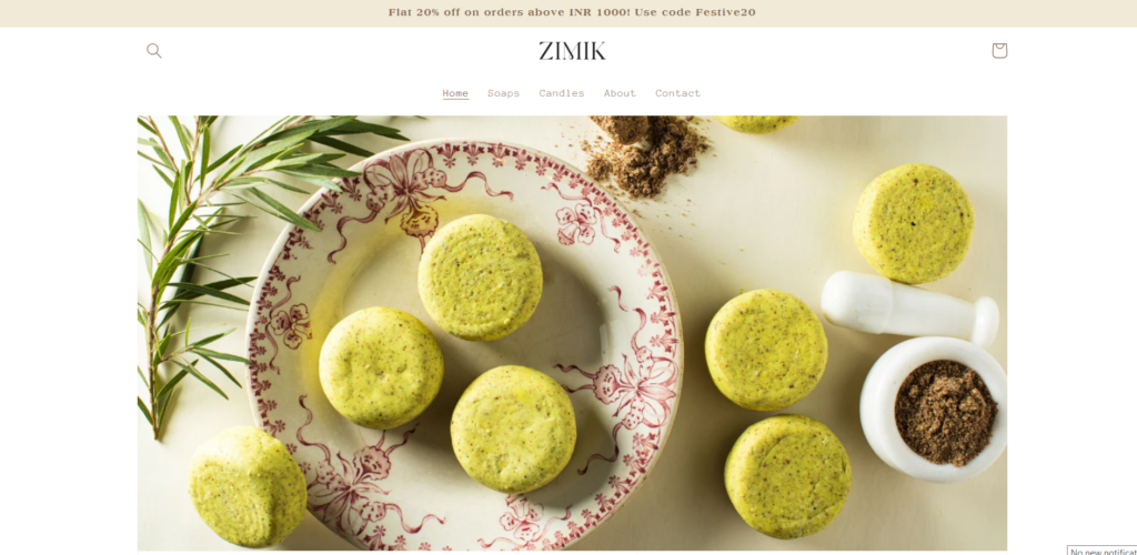
Zimik Studio:
Offering handcrafted soaps and candles, Zimik Studio’s warm personality shines through with carefully chosen colors and minimal distractions.
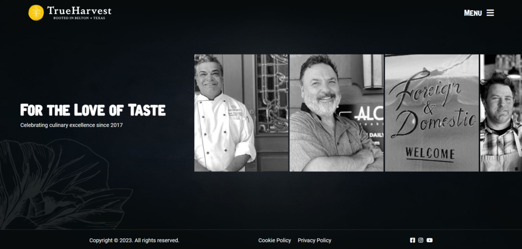
TrueHarvest Farms:
While appearing simple, TrueHarvest Farms packs functionality, using a dark color scheme to highlight products upon interaction.
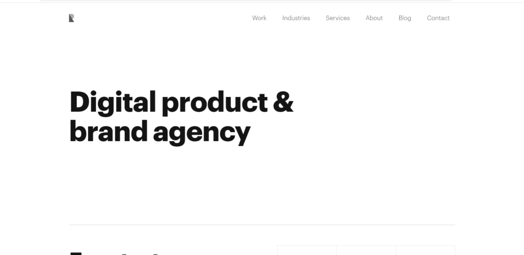
Ramotion : Simplicity in Messaging
Ramotion brings simplicity to the foreground with its website design. The large font on a white background makes it easy for readers to understand their message. The navigation bar contains select pages that users may want to visit without cluttering the area.
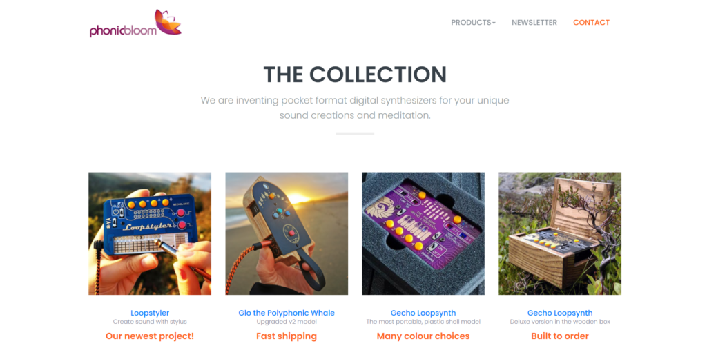
PhonicBloom: Harmonizing with Synthesizers
PhonicBloom specializes in synthesizers for audio creations. You can find their products within a well-placed grid structure on a simple, white background. The product names and descriptions can help creators identify the right instrument for the job.
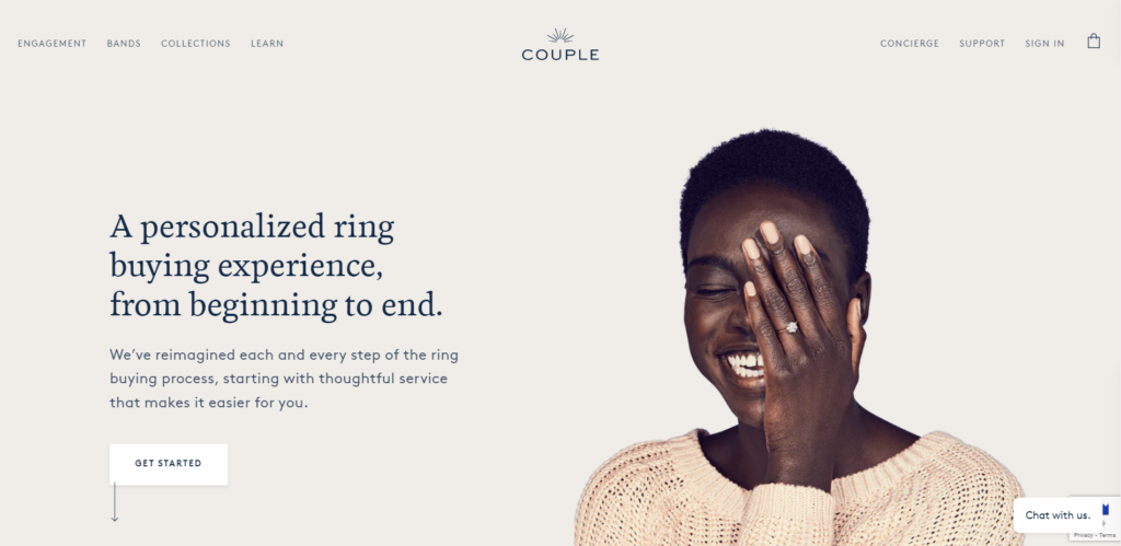
Couple: Elegance in Online Jewelry
Couple is an online jeweler that offers engagement rings and other fine wares. Everything comes together in a delicate palette of soft whites, blues, and greens. Clicking through to a category, you will find few distractions to detract from the purchasing process.
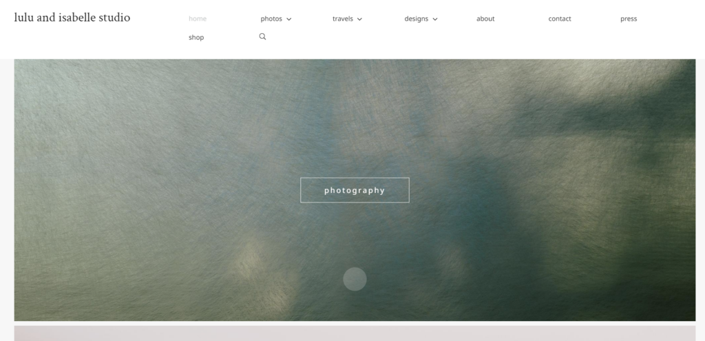
Lulu and Isabelle: Capturing Moments Simply
Lulu and Isabelle serve as a portfolio for Oanh Tran, who enjoys taking professional photographs and creating detailed graphics. The website presents the main categories to visitors without unnecessary text. The simple design allows potential clients and employers to view her work with a few uncomplicated clicks.
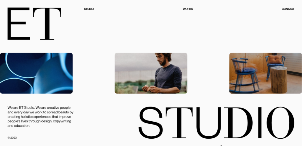
ET Studio: Portfolio in Bold Letters
ET Studio takes the cake in the minimal category with its version of a portfolio website. The first things you see on the landing page are large letters atop a white background, with nothing but page links. From this point, you can choose to visit one of the few available pages via the navigation bar.
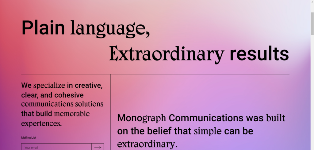
Monograph : Crafting Words with Clarity
Monograph offers writing services on its elegant website. The web designer makes it easy to notice the purpose of the website with minimal chaos. A color gradient draws the eyes toward the different areas of expertise. The menu is squared away in a neat little button that opens a larger version when clicked.
Dizal : Building Excellence in Construction
Dizal serves the construction industry with its aluminum and cellular PVC products. Their website presents information in a high-quality, minimal fashion and places key images atop dark colors. Users can easily find aluminum panels, PVC planks, and more by scrolling on the main page.
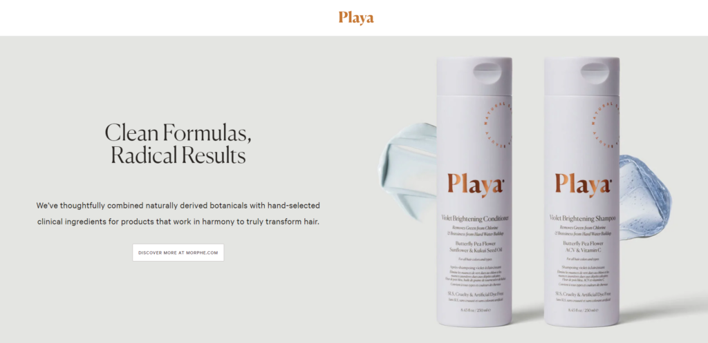
Playa: Minimalism in Beauty E-Commerce
Playa offers beauty products on a minimal e-commerce website. One large picture with a blurb discloses the purpose of the site in an elegant and tranquil manner. The pastel colors meld well with the overall website aesthetics.
Studio Rotate: Engaging E-Commerce Experiences
Studio Rotate uses images to capture the attention of users in an exciting manner. As you scroll, the images move in different directions and pause in place in anticipation of your clicks. Each link will take you to an ecommerce website project that has made a paying client happy.
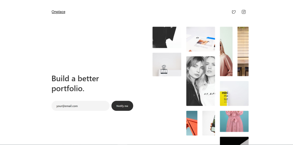
Onplace: Simplicity in Product Presentation
Onplace employees have a simple design for their website that features moving images and small blurbs about their product. They waste no words on their services, demonstrating their expertise through samples. An email-capture field centered in the hero section observes its importance.
Pocket Knife: Focused on the Squarespace Platform
Pocket Knife design agency focuses on the Squarespace platform. A black background with white expresses their expertise neatly and calmly. This company cuts right to the chase with a barebones approach to website design.
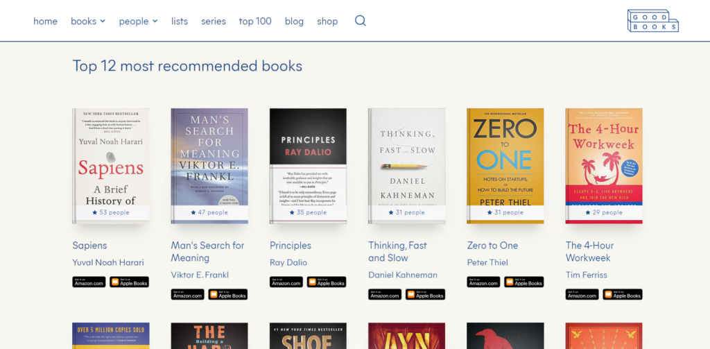
Good Books: Presenting Popular Titles
Good Books presents popular titles in a straightforward interface. You can find book recommendations and highlights sprinkled in-between quotes. This website is an excellent example of functional, minimalistic design paired with precision marketing.
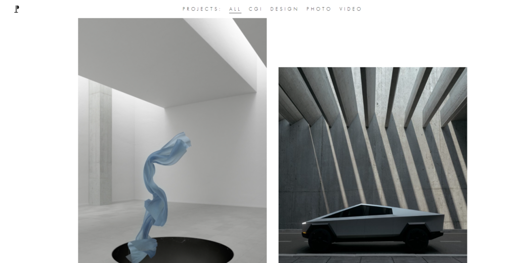
Ignant: Simplifying with Detailed Photos
Ignant makes things simple with a white background and detailed photos. This production company lets their work do the talking as they take visitors for a ride through their extensive portfolio. Large corporations seem to favor them, as witnessed in their list of past clients.
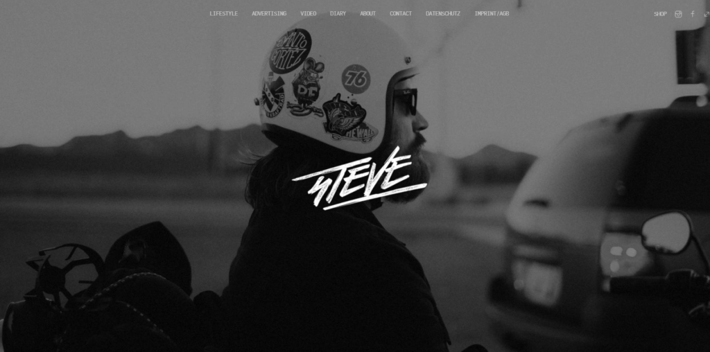
Studio Steve: Photography Without Words
Studio Steve is an excellent photography website that has just about zero words. On the home page, you are greeted with a simple image that loads the portfolio upon clicking. You can see how masterful the photographer is at his craft just by the quality and diversity of the images that emerge.
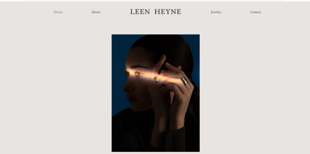
Leen Heyne: Selling Fine Jewelry with Elegance
Leen Heyne sells fine jewelry on a minimalistic website. Photos of his jewelry in action adorn the center of the page, capturing your attention and highlighting their elegance. Contact information is easy to find and can be used for ordering his specialty jewelry.
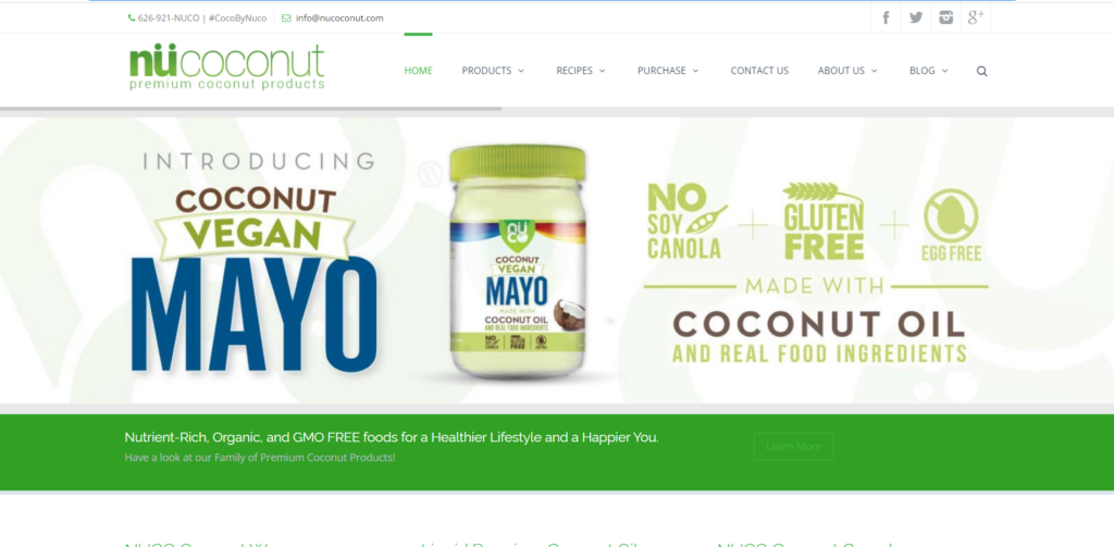
Nucoconut : Showcasing Premium Coconut Products
Nucoconut sells premium coconut products that may otherwise be hard to find elsewhere. The limited color palette embraces the product images as the star of the show. An image rotator presents various products users might be interested in purchasing.
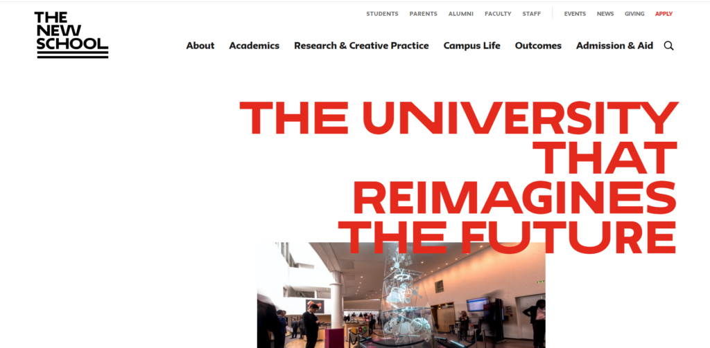
The New School : Informative Video in Full Screen
The New School takes advantage of minimalistic design by featuring an informative video on the home page. A sharp contrast in colors helps visitors read with ease, and various helpful links are available on the navigation bar.
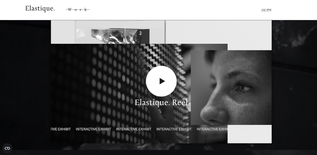
Elastic: Clean Presentation of Projects
Elastic looks great from afar and does well with its simplified presentation style. This agency presents each project as a large image with a clickable link that takes you to the details. This design is an effective minimalistic style that allows visitors to engage at will.
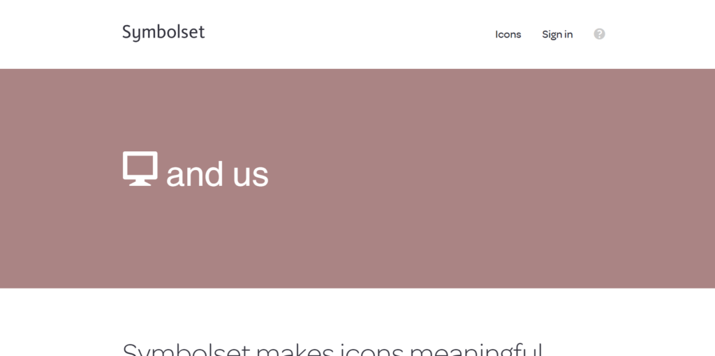
Symbolset: Transforming Text into Symbols and Icons
Symbolset allows users to convert typed text into symbols and icons. The flashy image demonstrates its capabilities while maintaining user interest. You can try typing something into the field to test the app, too. Scroll down to see a list of features and a list of friendly companies.
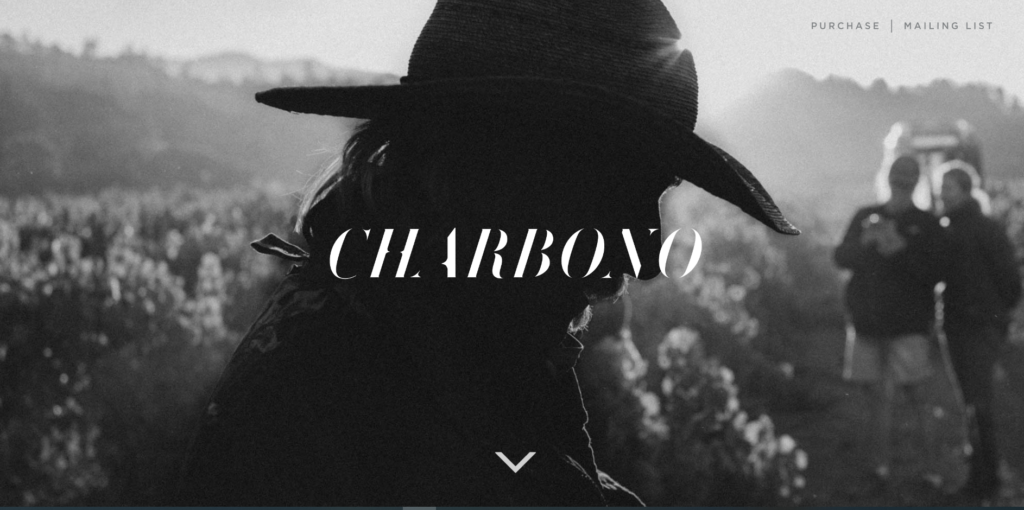
Matt Morris Wines: Grayscale Tones Indicating Value
Matt Morris Wines make good use of gray tones to indicate the value of their wines. Crisp photos on a black background give it a historically premium feel. Powerful images and rich storytelling take the reader on a journey to discover the perfect wine.
Andluca: Smart Window Technologies
Andluca focuses on smart window technologies and keeps its website in compact condition. A strong, white background contrasts perfectly with the black typography, allowing users to spend more time on the information without becoming distracted by extra elements.
Blue Dog: Cozy Atmosphere in a New York Restaurant
The Blue Dog restaurant is in New York. Their website presents a cozy atmosphere with three simple words: eat, drink, and visit. Visitors can find what they need through any of these links or the simple navigation bar that contains additional information.
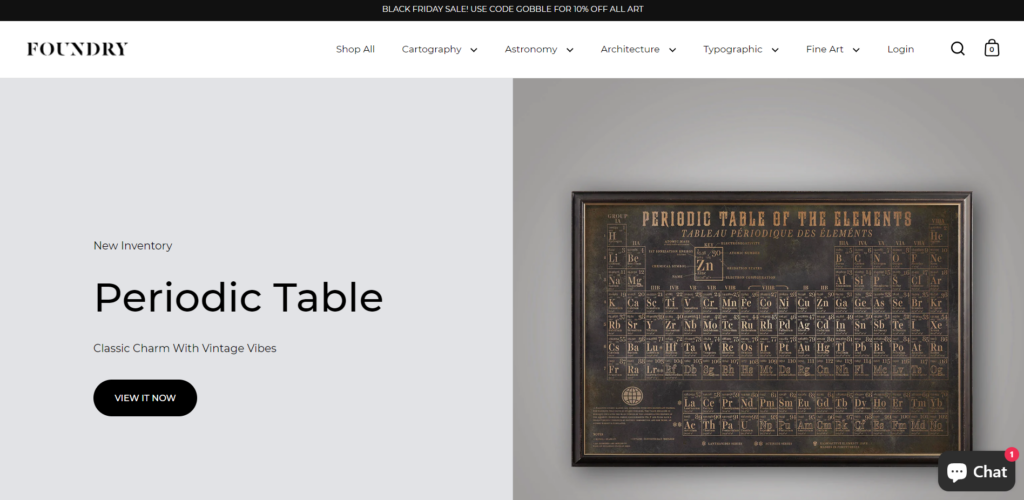
Foundry: Impressing with Optical Appeal in a Minimalistic Manner
Foundry seeks to impress you with optical appeal in a minimalistic manner. Photos lead the way in this simplistic design, prompting the shopper to imagine having the actual art print in their home. The menu opens up filters for shopping by category, too.
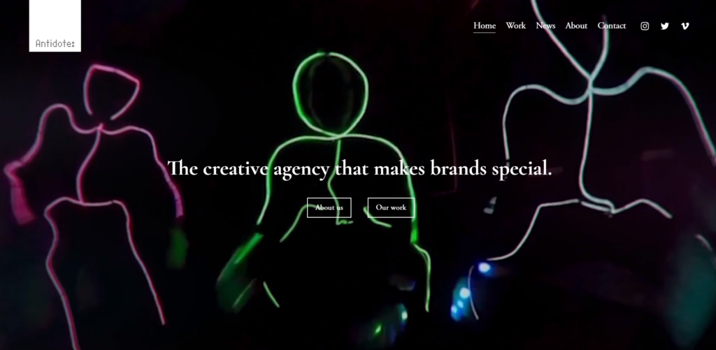
Antidote: A Creative Agency for Brand Growth
Antidote is a creative agency that helps brands grow and expand. The home page features a rotating set of animated images that shine with quality. It feels like you’re in the middle of a corporate commercial as it’s being filmed.
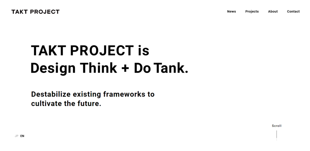
Takt Project: Nice and Simple with Color Choices and Past Projects
Takt Project keeps things nice and simple with its color choice and focuses on past projects. Select images are the focal point for your eyes as you scroll downward. Change the language from Japanese to English or vice versa with a swift mouse click.
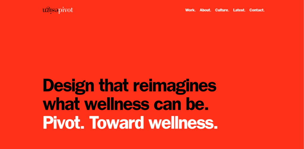
Pivot Design: Bright Colors, Contrasting Fonts, and Animated Images
Pivot Design keeps things squeaky clean with bright, contrasting colors and fonts. Scrolling through, you can see how just a handful of animated images can convey the right messages.
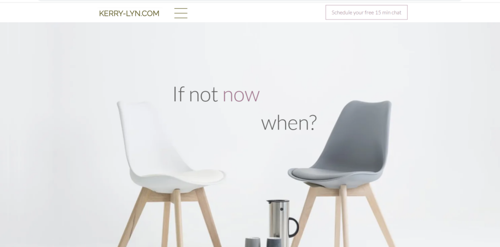
Kerry Lyn: Simple and Approachable Psychotherapy Practice
Kerry Lyn makes her psychotherapy practice simple and approachable with a minimalist website. The soothing colors and readable font form a welcoming atmosphere for potential clients.
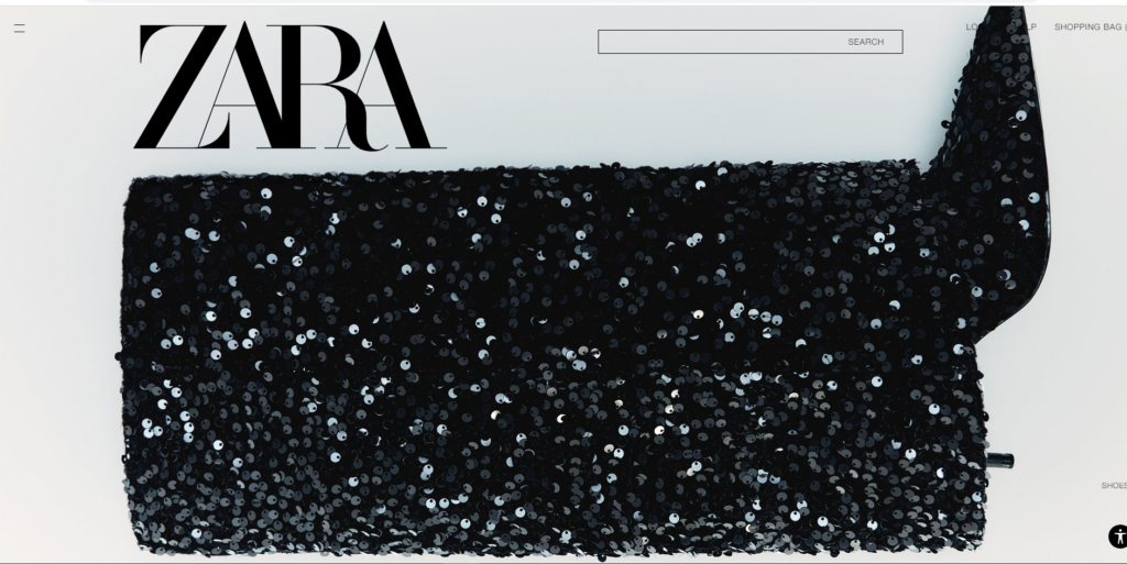
Zara: Captivating Attention with Full-Screen Media
Zara captures your attention with full-screen media, chosen to appeal to your fashion sense. Shoppers can feel the intensity as the content changes automatically. The navigation is simple and straightforward without distracting from the style.
Epok Design: Graphic Posters with Simplicity
Epok Design sells graphic posters on their simplistic website. They hook you in with an image rotator that showcases some of their best works. Images speak for the company here, where fewer words and other elements are more acceptable.
Siiimple: Simplicity in CSS Collections
Siiimple keeps things simple with a grid layout that showcases their collections. You can hover over any image to get a menu that takes you to the description page or directly to the website. This minimalist CSS gallery loads quickly and gives users a fun experience.
Conclusion:
These minimalist website examples showcase how simplicity can be impactful and engaging, allowing users to focus on the content that matters most. Each design reflects the essence of the brand or individual it represents while offering a seamless and visually pleasing experience. In the world of web design, less can indeed be more.
Posted by: marc B Category, Web design